Fifer Forestry and Construction
Fifer Forestry and Construction was designed to embody a bold, distinctive presence. The brand’s logo, set within a trapezoidal shape with softened corners, draws inspiration from the iconic National Forest signs, symbolizing the company's strong connection to nature and dedication to exceptional craftsmanship.
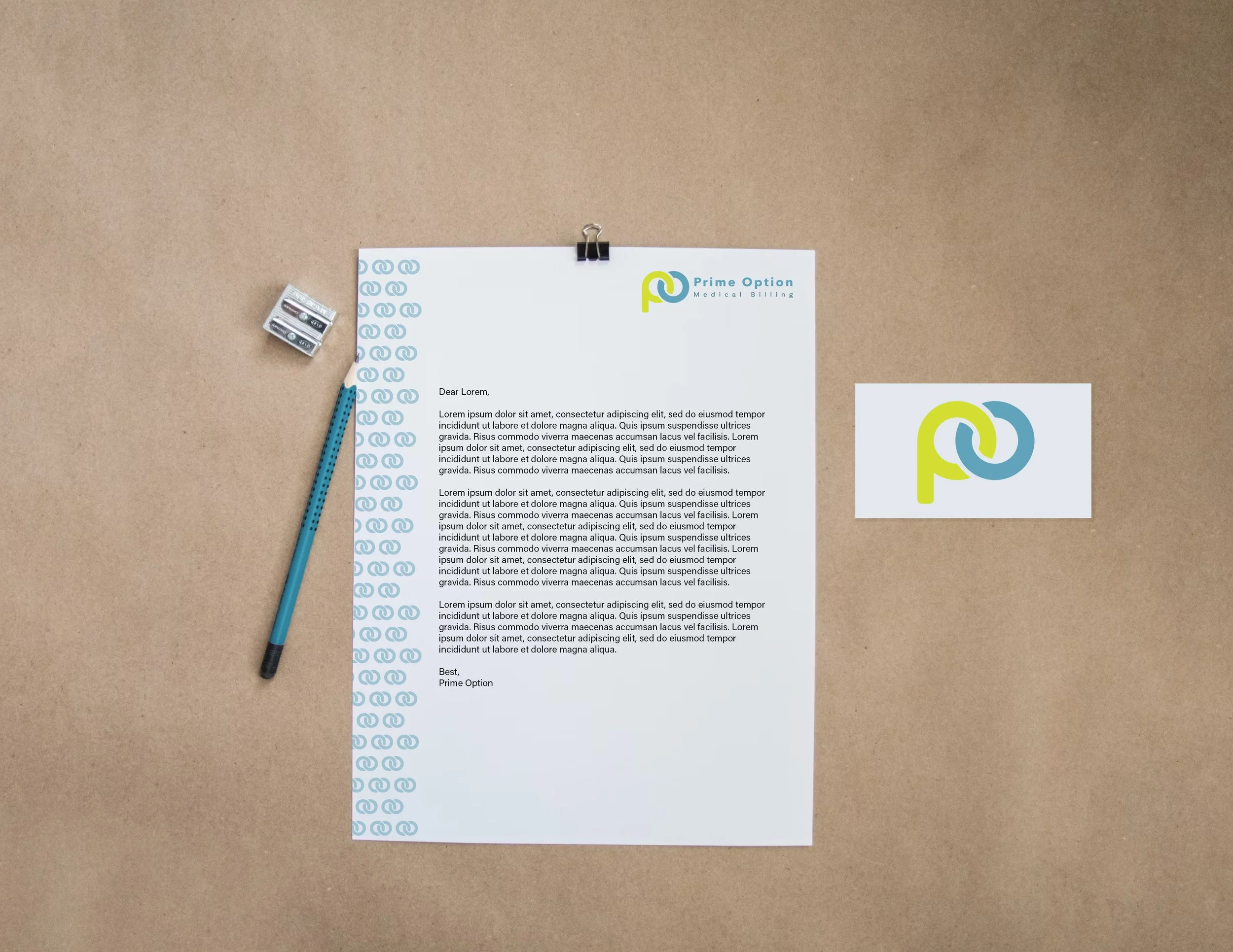
Prime Option Medical Billing
Prime Option Medical Billing is a medical billing company centered on reliability, optimism, and trust. Their brand was crafted to reflect these core values, emphasizing a commitment to dependable service and positive client relationships.
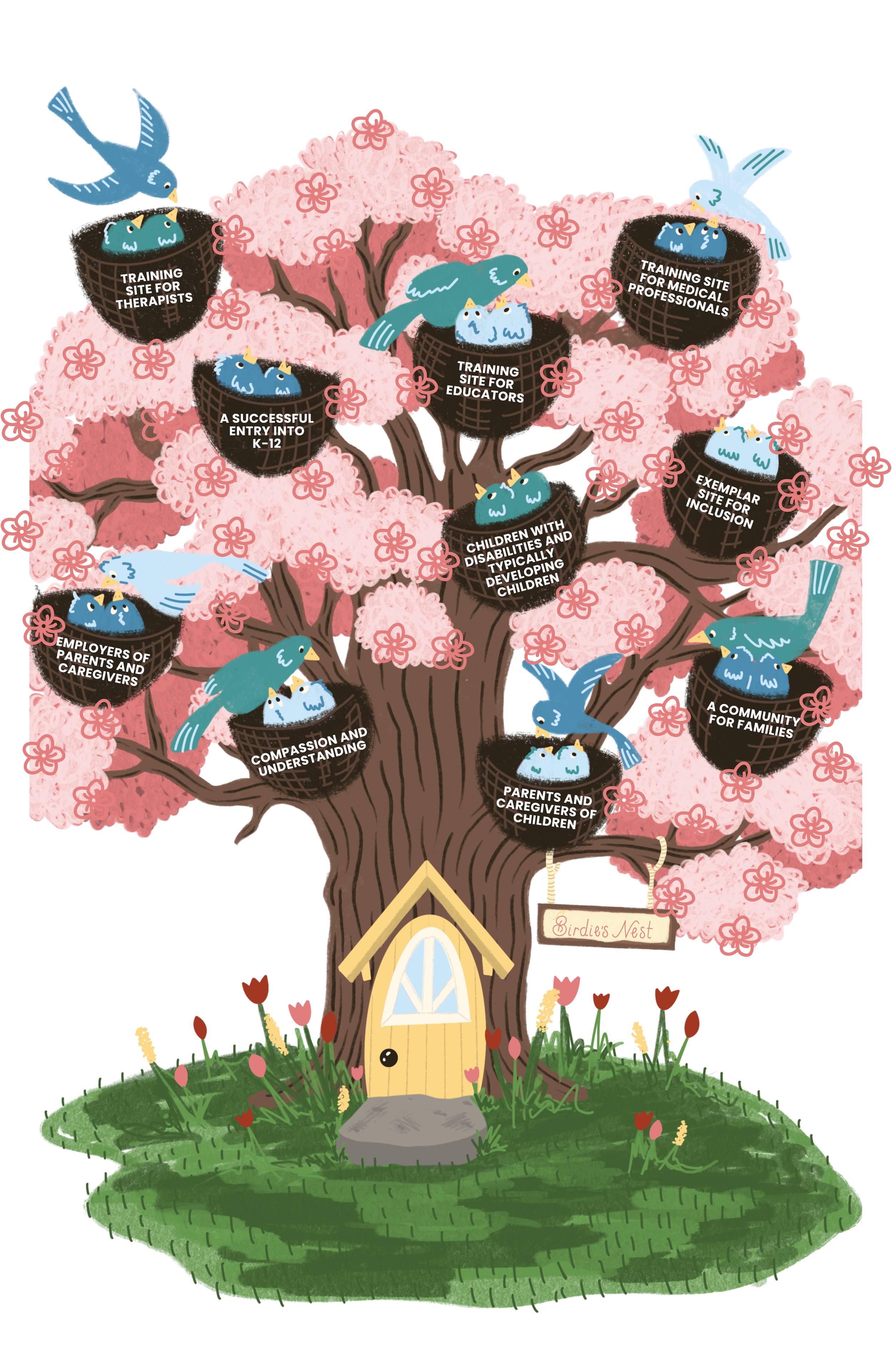
The Rosalie Murrey Memorial Foundation is a nonprofit organization dedicated to providing enriching and inclusive early childhood learning experiences for children with disabilities. We developed their brand identity, designed a range of assets and stationery, and created their website to support their mission and enhance their outreach.
Rosalie Murrey Memorial Foundation
The Sun Rental Center in Colville, WA, underwent a rebrand to introduce a modern look that thoughtfully retains elements of its original identity. This project included the creation of updated branding and marketing materials, giving the center a refreshed yet familiar presence.
Sun Rental Center
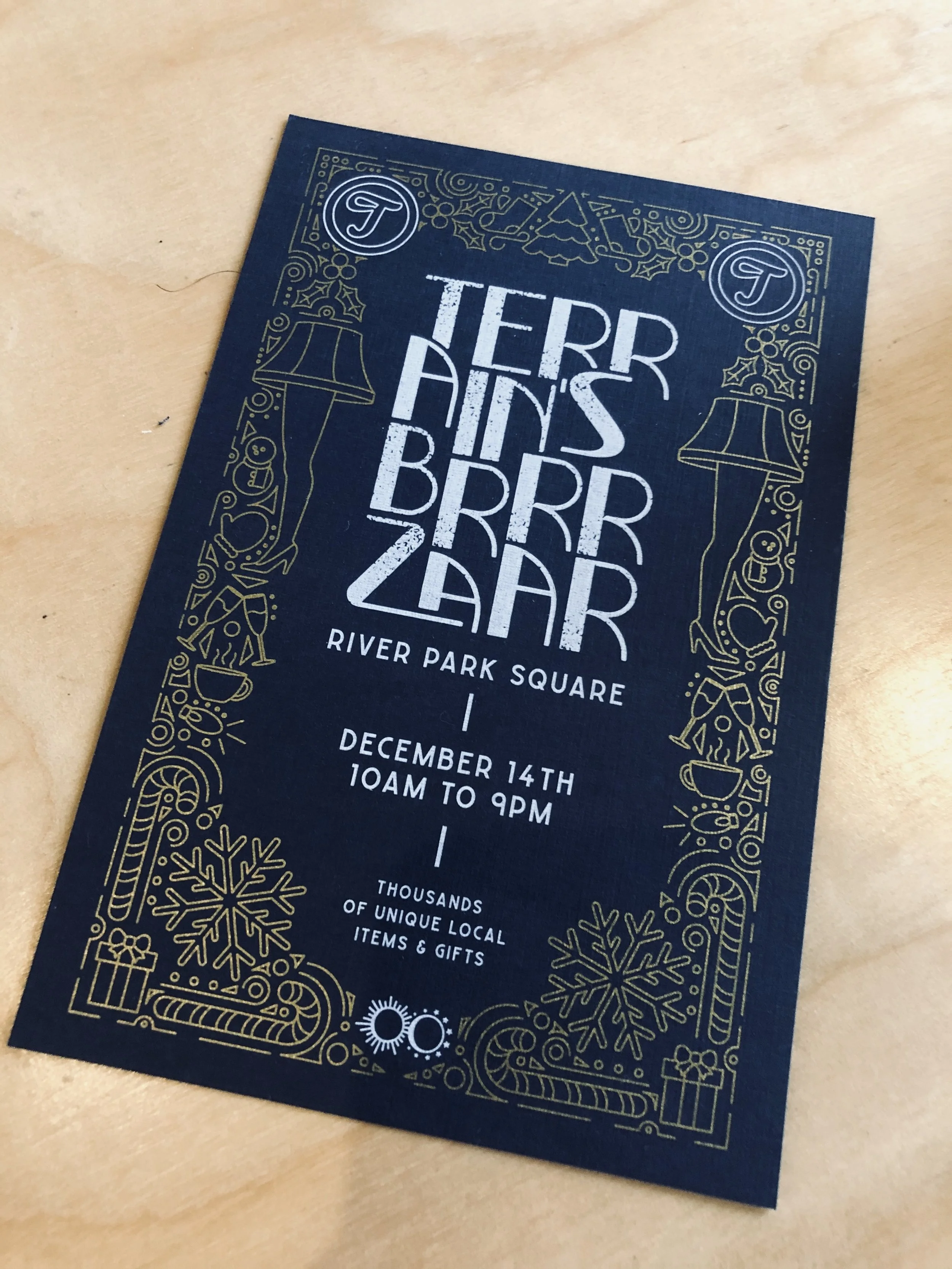
Terrain throws an event called Brrrzaar where artists get together and sell their goods and creations. They asked for advertising materials for this event. This includes printed posters and social media assets. These were created when I was a intern at Maker and Made. I created all of the illustrations and they handled the typography assets of these marketing assets.
Terrain’s Brrrzaar
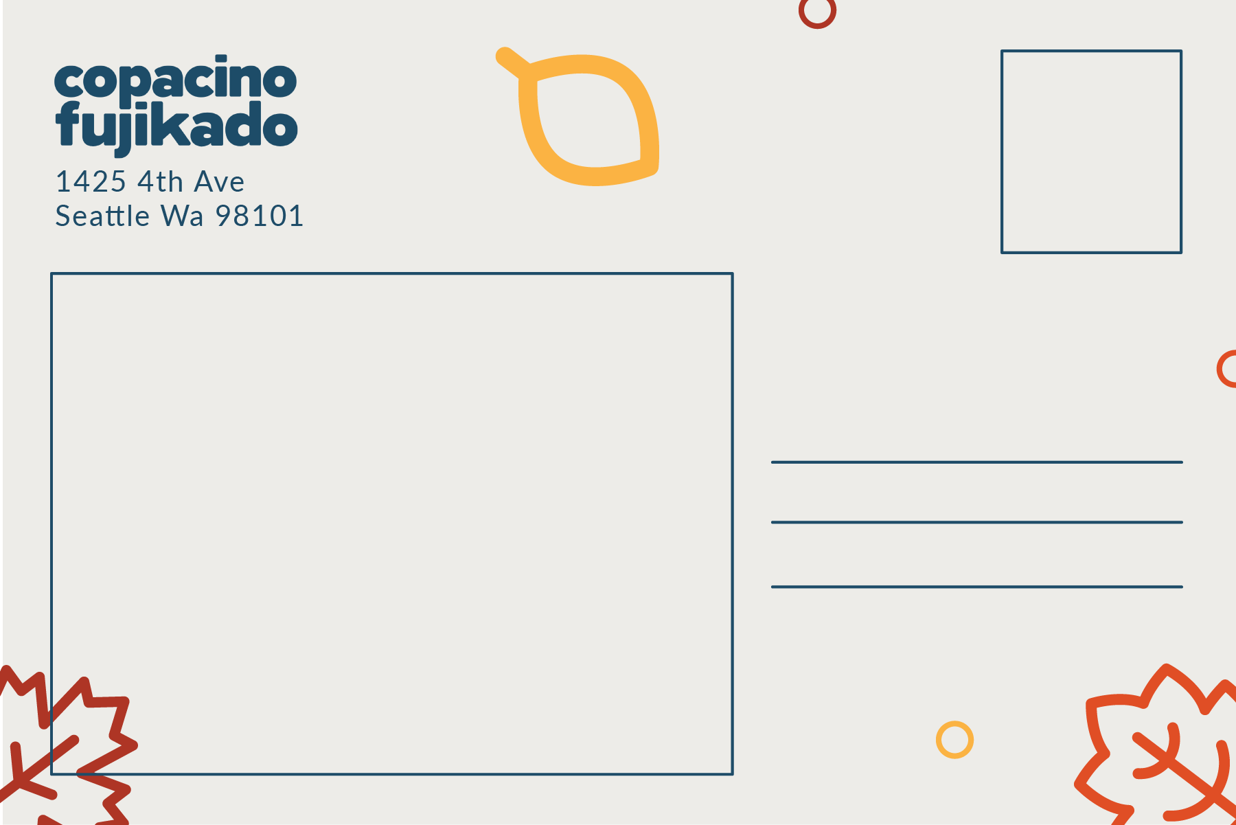
Copacino Fujikado wanted to celebrate Thanksgiving by sending out "Gratitude Grams" to their employees, creating a warm and festive atmosphere within the team. The designs feature a vibrant autumn-inspired color palette, with cheerful leaves and acorns that evoke the cozy, inviting feel of the season. Each element is thoughtfully crafted to convey appreciation and joy, enhancing the feeling of gratitude. The playful illustrations and friendly typography work together to make these Gratitude Grams both memorable and heartwarming, adding a touch of seasonal cheer to the workplace.
Gratitude Grams
Silent Strength
This white charcoal drawing on black paper captures the fierce intensity of a tiger's gaze, emphasizing realism through meticulously rendered fur textures and patterns. The high contrast between the dark background and bright white charcoal highlights brings depth and dimensionality, making the details of the tiger’s face and coat strikingly vivid. The focus on fine details showcases technical skill and dedication to lifelike representation, making this piece both visually powerful and captivating.
Nature’s Armor
This top-down wood-burning artwork captures the intricate details of a beetle with striking realism. The natural texture of the wood grain adds depth to the piece, enhancing the lifelike quality of the beetle's hard shell and delicate legs. Through precise line work and shading, this piece brings out the complex patterns and textures of the beetle, making it appear almost tangible. The use of pyrography showcases both technical skill and a deep appreciation for nature's small wonders.
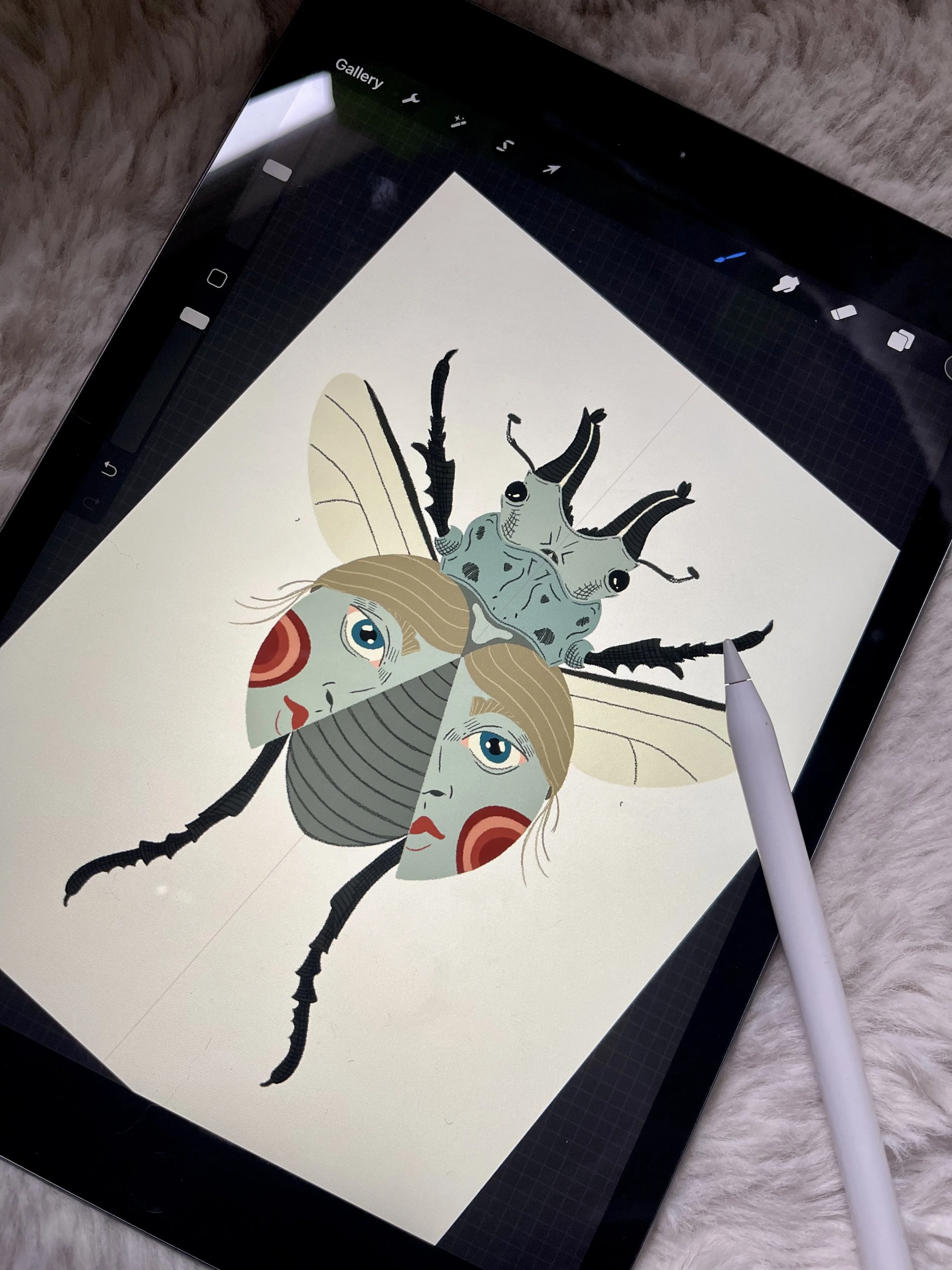
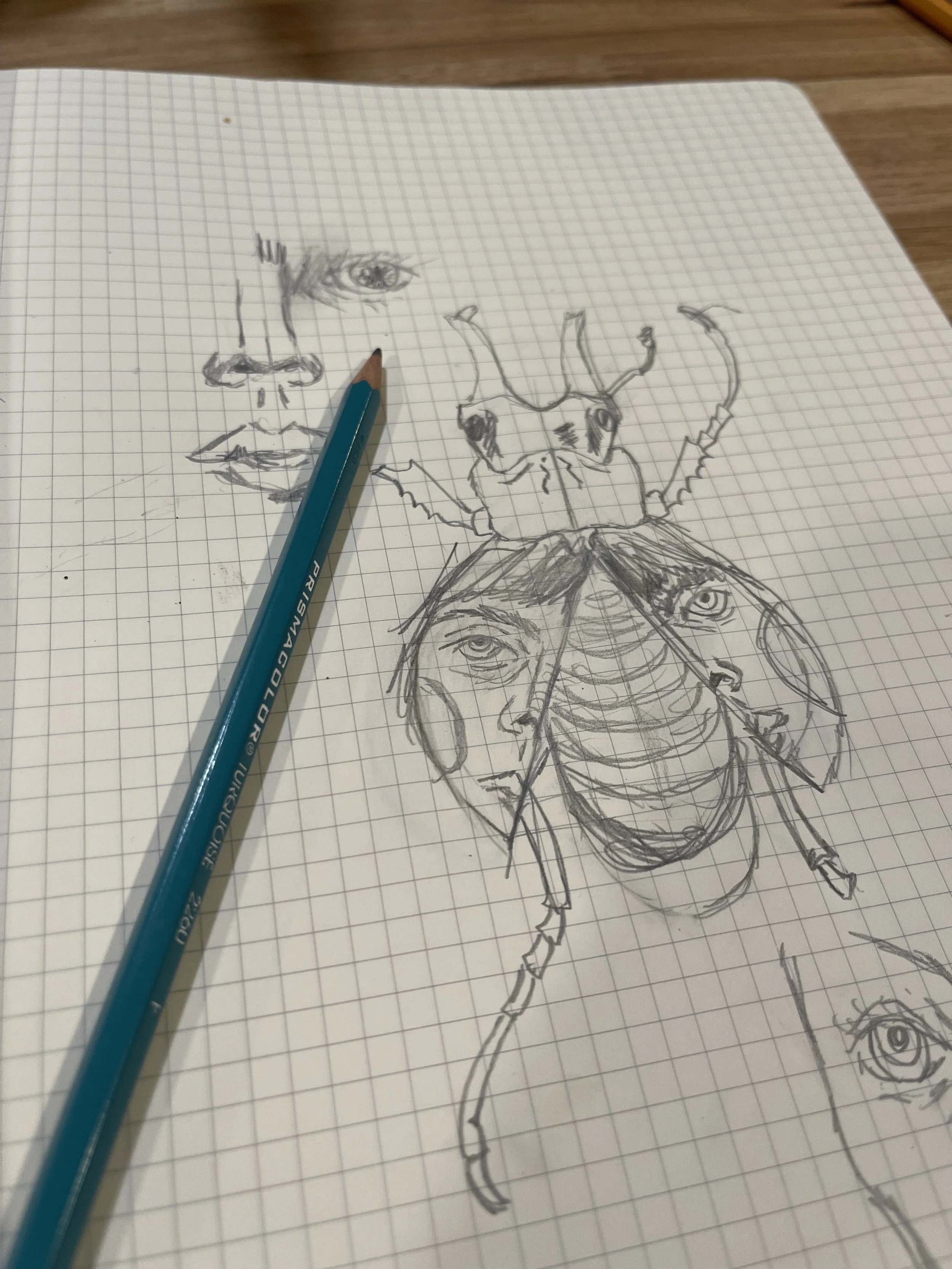
Revealing Reflections
Each beetle illustration reveals an intricate design, with wings spread to expose patterns that resemble human faces within their abdomens. The natural symmetry of the wings frames these face-like details, merging insect anatomy with subtle, human-like expressions. This blend of realism and surreal elements invites a deeper look, capturing both beauty and intrigue. The careful balance of lifelike texture and imaginative detail brings each beetle to life as a captivating, almost otherworldly character.
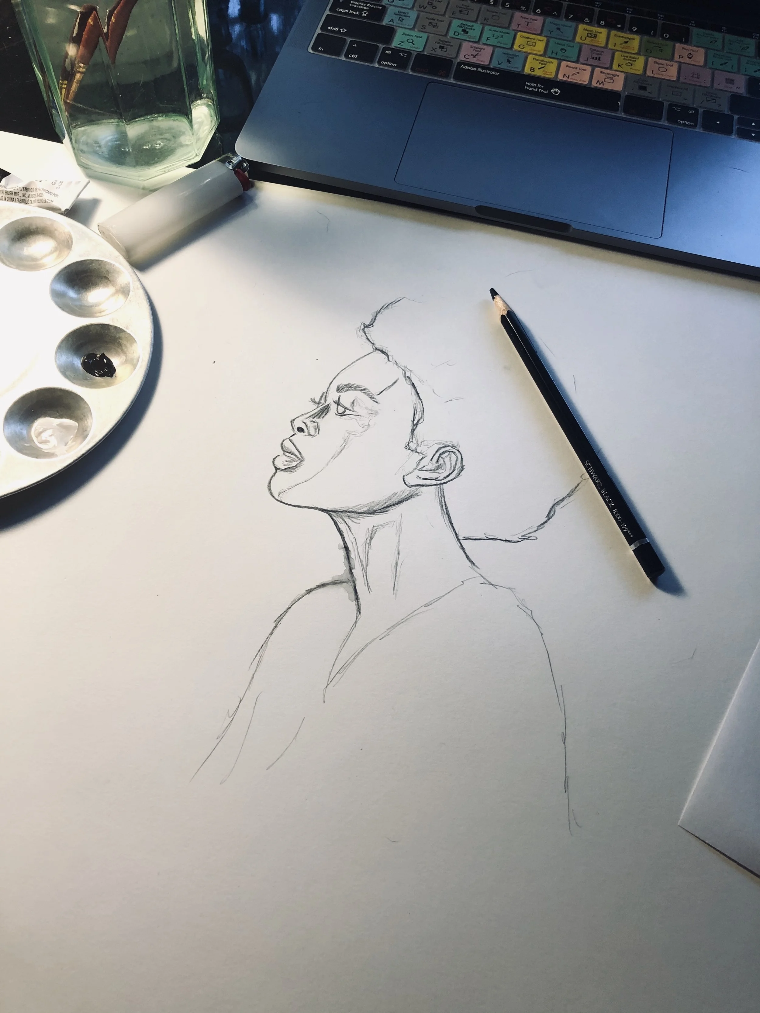
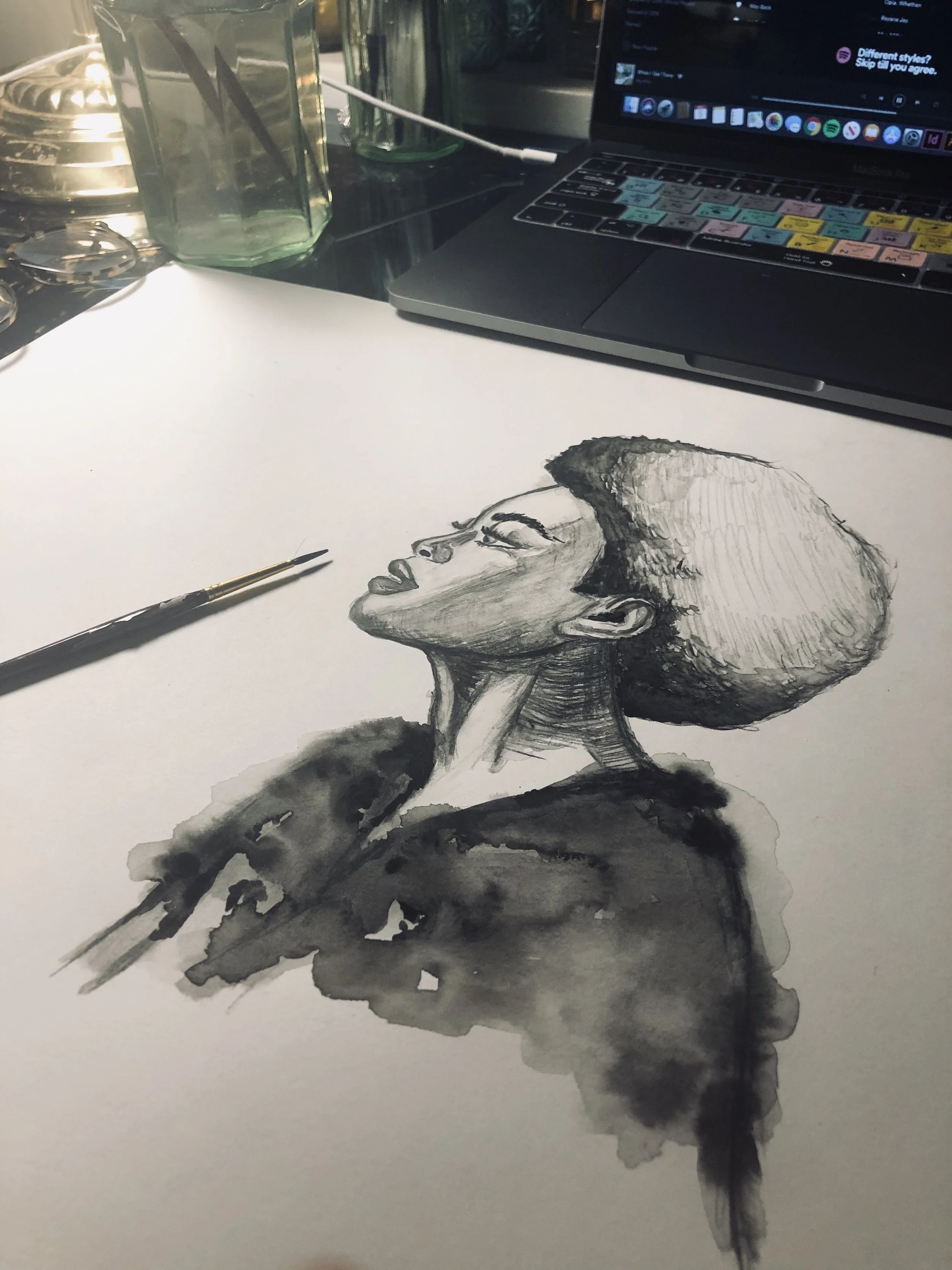
Echoes of Grace
This watercolor pencil piece delicately captures the essence of beauty in both form and expression. The soft shading and gentle gradients bring a quiet elegance to the woman’s profile, highlighting her serene gaze and natural grace. The blending of watercolor creates a soft, almost dreamlike quality, while the pencil adds precise details, balancing fluidity with structure. This piece celebrates beauty in its purest, most contemplative form, inviting the viewer to pause and appreciate the harmony of simplicity and depth.
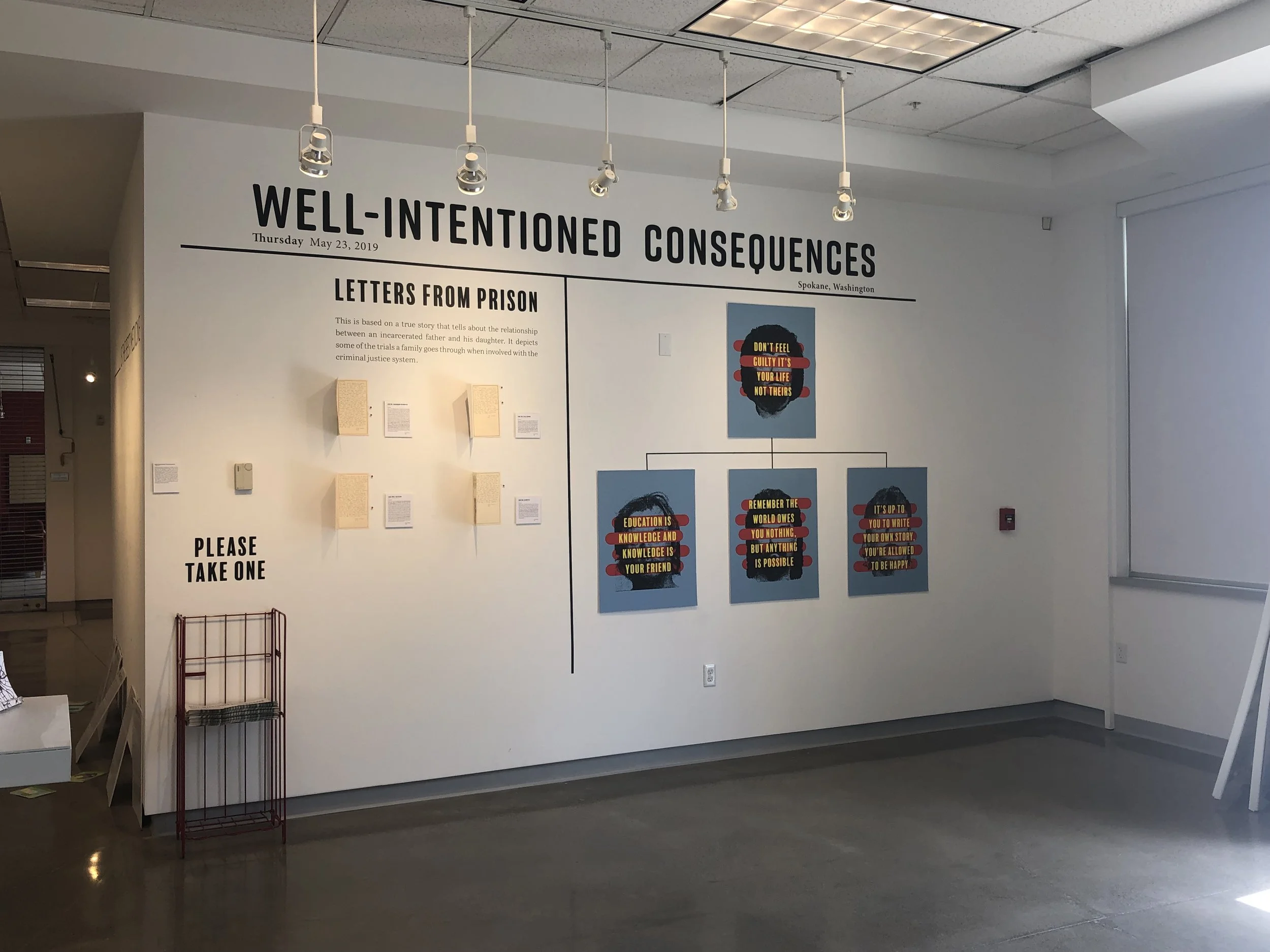
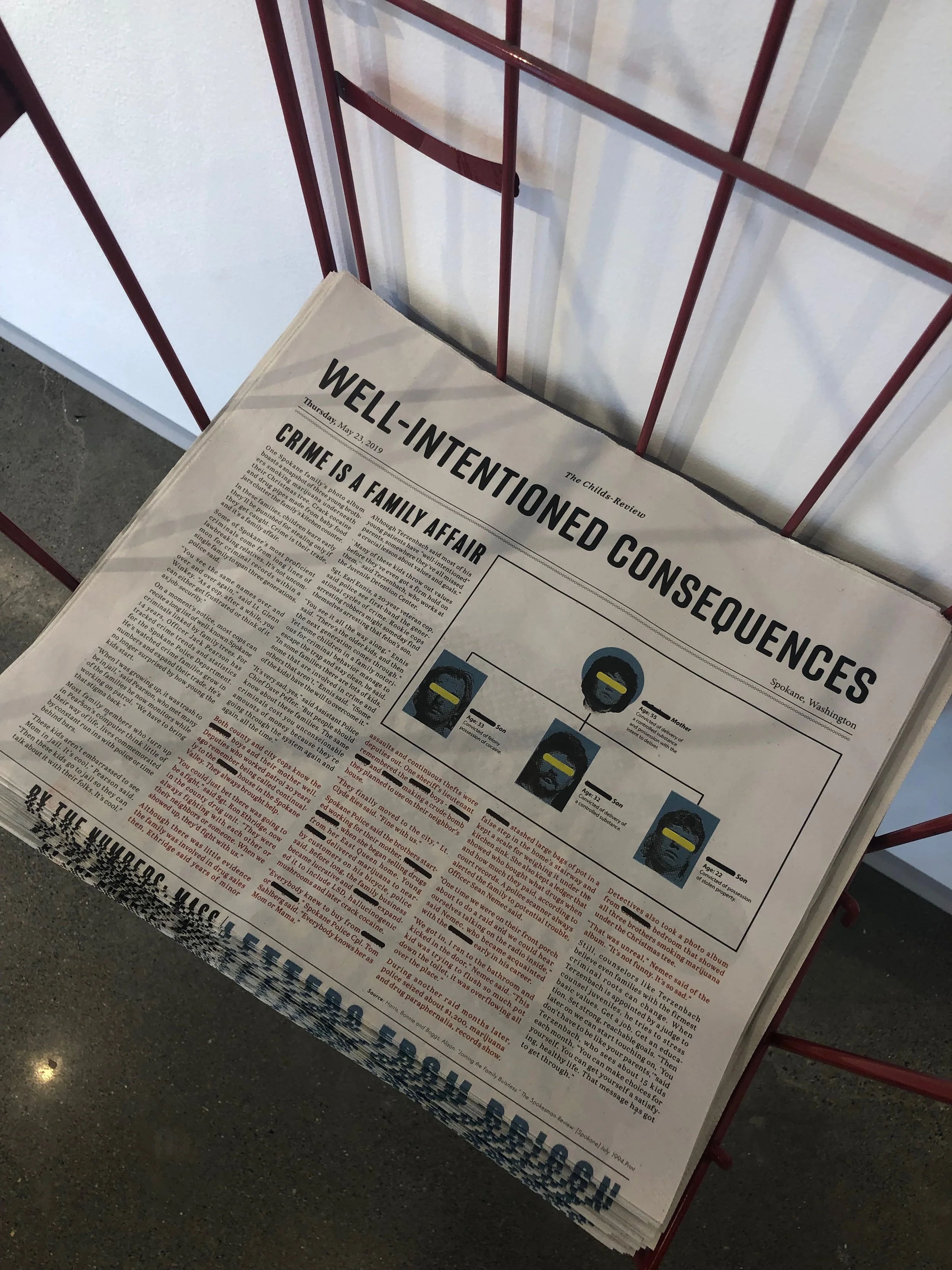
Well-Intentioned Consequences
Well-Intentioned Consequences is based on a true story about the relationship between an incarcerated father and his daughter. It depicts some of the trials a family goes through when involved with the criminal justice system. It takes real statistics and compares them to a real story to show how the impacts play out in the real world and how this impacts can foster a cycle of criminality. Everyone on both sides of the system are trying their best with what they have, but I was inspired to bring a new view on the subject. Normally, the focus is either on the criminal or the police, there is not much attention given to the impact that this has on the families of the incarcerated.


